

Texture is defined as the tactile and visual surface quality of a fabric, and its role in upholstery design shapes everything from how a sofa feels beneath your hand to how it reads across a room. Industry professionals treat texture as a core design principle, equal in weight to color and proportion, not a finishing detail applied after the real decisions are made. A fabric’s surface character determines comfort, perceived scale, light behavior, and long-term usability. Whether you are selecting fabric for a single statement sofa or coordinating an entire interior, understanding how texture works gives you a decisive advantage.
How does texture influence the visual perception of upholstered furniture?
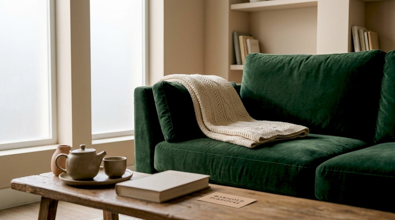
Texture changes how furniture looks before anyone sits on it. Coarse, high-pile fabrics make a sofa appear larger and heavier, adding visual mass to a piece. Smooth, tight weaves do the opposite, making the same silhouette read as lighter and more refined. This means texture is a spatial tool, not just a surface choice.
Light behavior is where texture’s visual power becomes most dramatic. Matte and deeply textured surfaces absorb light, making colors appear richer and darker. Smooth or high-sheen finishes reflect light, lifting colors toward a brighter, airier tone. A navy velvet sofa and a navy linen sofa carry the same dye but read as entirely different colors in the same room.
Texture and room proportion
Texture also shapes how a room feels spatially. A heavily textured sofa in a small room can crowd the space visually, while a sleek, smooth piece in the same footprint reads as less imposing. Designers use this effect deliberately, placing high-pile or bouclé pieces in larger rooms where the added visual weight anchors the space rather than compresses it.
Texture acts as a sensory index, recording how bodies inhabit a space and shaping the room’s atmosphere over time. A room furnished entirely in smooth fabrics can feel cool and formal; one layered with varied textures feels lived-in and warm. That atmospheric shift is not accidental. It is the direct result of deliberate textile choices.
Pro Tip: Hold fabric swatches against your wall color in the actual room light before committing. Texture changes color dramatically between a showroom and your home.
| Fabric type | Visual effect | Best use |
|---|---|---|
| High-pile velvet | Adds visual weight and depth | Large rooms, statement pieces |
| Smooth linen weave | Lightens and refines silhouette | Small rooms, minimalist styles |
| Bouclé or looped | Creates organic, textured mass | Casual, cozy interiors |
| Chintz (flat floral print) | Crisp, light-reflective surface | Traditional and garden-inspired rooms |
What are the sensory and ergonomic effects of upholstery texture?
Comfort is not just about cushion fill. The fabric surface itself determines how a piece feels during long sitting sessions, and the science behind this is called haptic engineering. Haptic engineering balances friction behavior and thermal exchange to enhance posture stability and overall comfort. This means the grip or slip of a fabric surface directly affects how your body holds its position over time.
The contrast between smooth and textured fabrics is most obvious in real use. Smooth fabrics like leather feel cool initially but can become slippery, reducing posture support during extended sitting. Textured fabrics like chenille provide better grip and breathability, keeping the body stable and comfortable. For a sofa used daily by a family, that ergonomic difference matters as much as the cushion rating.
Fabric hand and long-term satisfaction
“Fabric hand” is the industry term for a textile’s tactile character, the way it feels when touched, draped, or pressed. Fabric hand is a top source of post-installation dissatisfaction, often outweighing technical durability metrics. A fabric can pass every wear test and still feel wrong to the person sitting on it daily.
Texture resilience matters just as much as initial feel. Some fabrics soften beautifully with use; others pill, flatten, or lose their surface character within a year. Knowing how a texture ages is part of choosing it well. The key sensory factors to evaluate before purchasing include:
- Grip vs. slip: Does the fabric hold your body in place, or do you slide forward?
- Thermal feel: Does the surface feel warm or cool to the touch, and does it retain heat?
- Breathability: Does air move through the weave, or does the fabric trap warmth against the skin?
- Softness under pressure: Does the texture feel pleasant when you press your palm flat against it for several seconds?
- Pile direction: For velvet and similar fabrics, does the pile direction affect how the color reads when you sit?
Pro Tip: Sit on a fabric sample for at least five minutes in your normal posture before selecting it. Short showroom touches do not reveal how a texture performs under sustained contact.
How do you select and layer upholstery textures effectively?
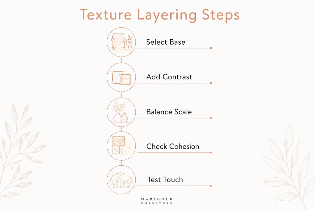
Selecting textures well requires a framework, not just instinct. The most reliable starting point is the 80/20 rule for upholstery: 80% of the room’s upholstery should use smooth or subtly textured fabrics, with 20% reserved for bold tactile accents. This ratio maintains visual cohesion while preventing the flatness that comes from a single-texture room.
Contrast is the engine of good texture layering. Pairing a smooth fabric with a rough one creates visual interest without clutter. Pairing two bold textures of similar weight creates competition, where neither reads clearly. The goal is a hierarchy: one dominant texture, one supporting texture, and one accent.
Matching texture to style and lifestyle
Style intent should drive texture selection before color does. Natural textiles like linen, cotton, and sustainable upholstery materials suit cozy, organic interiors. Sleek, smooth fabrics suit minimalist or contemporary spaces. Chintz and floral prints, with their crisp, flat surfaces, carry a heritage quality that suits traditional and garden-inspired rooms beautifully.
Lifestyle factors are non-negotiable in texture selection. Dense velvet is durable and wear-resistant, but looped fabrics like bouclé are vulnerable to pet claws and can unravel quickly. A household with cats or dogs needs to factor that reality into every texture decision. The most beautiful fabric is the wrong choice if it deteriorates within a season.
The numbered steps below give a repeatable process for texture selection:
- Define the room’s dominant mood. Cozy and warm calls for soft, matte textures. Crisp and formal calls for smooth, light-reflective surfaces.
- Choose the primary fabric first. This covers the largest upholstered surface and sets the texture baseline for the room.
- Select a contrasting secondary texture. It should differ in weight and surface character from the primary fabric.
- Add one bold accent texture. This appears on a throw pillow, ottoman, or accent chair, not on the main sofa.
- Test all three together in the actual room light. Texture combinations read differently under natural versus artificial light.
- Evaluate for lifestyle fit. Check durability ratings and pet or child compatibility before finalizing.
Manufacturers increasingly focus on subtle, linen-inspired textures matched thoughtfully to furniture form, balancing versatility with visual impact. That trend reflects a broader shift: designers now treat texture as equal to color in the planning process, not as a secondary consideration. Pairing texture with pattern matching principles adds another layer of control over the final result.
What are the most common texture mistakes in upholstery design?
The most frequent error is treating texture as decoration rather than as a structural design decision. When texture is chosen last, it often conflicts with the furniture’s silhouette, the room’s scale, or the color palette already in place. Texture chosen early shapes everything that follows.
A second common mistake is stacking too many bold textures in one space. When every surface competes for tactile attention, the room feels restless rather than rich. Texture should prevent neutral palettes from feeling bland, but that does not mean every surface needs to be bold. Restraint is a skill.
The following mistakes appear most often in upholstery projects, and each has a clear fix:
- Ignoring tactile comfort in favor of visual appeal. A fabric that photographs beautifully but feels rough or slippery will disappoint every day. Always test the hand before committing.
- Mismatching texture weight to furniture form. A heavy, high-pile fabric on a delicate, slender-legged sofa creates visual dissonance. Match the fabric’s visual weight to the piece’s silhouette.
- Skipping real-space testing. Texture looks and feels different in a showroom than in your home. Request samples and live with them for several days before deciding.
- Overlooking how texture ages. Some fabrics flatten, pill, or lose surface definition within a year of regular use. Ask about long-term wear behavior, not just initial feel.
- Choosing texture without considering upholstery grade fabric standards. A beautiful texture on a fabric rated for light use will fail quickly on a daily-use sofa.
Heavy textured fabrics with soft, matte finishes are trending because they invite touch without sacrificing usability. That balance is the target every upholstery decision should aim for.
Key Takeaways
Texture is the most underused design tool in upholstery, shaping comfort, scale, color, and atmosphere in ways that color alone cannot achieve.
| Point | Details |
|---|---|
| Texture shapes visual scale | Coarse, high-pile fabrics add visual weight; smooth weaves make furniture appear lighter and more refined. |
| Haptic engineering drives comfort | Friction and thermal exchange in fabric surfaces directly affect posture stability and long-term sitting comfort. |
| The 80/20 rule prevents clutter | Use 80% smooth or subtle texture and 20% bold accent texture to maintain cohesion and visual interest. |
| Fabric hand predicts satisfaction | Tactile character often matters more than durability ratings when it comes to long-term owner satisfaction. |
| Lifestyle fit is non-negotiable | Dense velvet suits high-traffic homes; looped fabrics like bouclé require careful consideration in pet-friendly spaces. |
Texture deserves a seat at the design table from day one
I have seen more upholstery projects go sideways over texture than over color. Color is the decision everyone agonizes over. Texture is the one they rush. That is a mistake I have watched play out in beautiful rooms that feel oddly cold, or in carefully chosen palettes that somehow fall flat. The culprit is almost always a fabric surface that was chosen for how it looked in a swatch, not for how it would perform in a room.
What I have learned over years of working with upholstered pieces is that texture carries emotional weight. A room furnished in smooth, light-reflective fabrics signals formality and restraint. A room layered with matte, soft, varied textures signals warmth and welcome. Neither is wrong. But the choice has to be intentional. When a client tells me a room “doesn’t feel right” despite a strong color palette and good furniture, I look at the texture story first.
The ergonomic dimension is the piece most designers undervalue. Fabric hand, the way a textile actually feels under sustained contact, shapes how people experience a piece of furniture every single day. A sofa that looks stunning but feels slippery or rough will quietly erode a client’s satisfaction over months. Getting the tactile character right is not a luxury consideration. It is the foundation of a piece that becomes a beloved companion in a home rather than a beautiful object people avoid sitting on.
My advice: treat texture as equal to color and proportion from the very first planning conversation. Choose your primary fabric texture before you finalize your color palette. Let the surface character of the fabric guide the room’s atmosphere, and let color refine it. That sequence produces rooms that feel as good as they look.
— Kevin O’Gara
Marigold Furniture’s approach to texture and custom upholstery
Thoughtful texture selection is built into every piece Marigold Furniture makes. Each sofa is handcrafted in Dallas and Los Angeles, with over 20 chintz and floral fabric choices that balance tactile richness with lasting durability. The Florence Arched Floral Sofa and the Seville Tufted-Back Floral Sofa each demonstrate how a well-chosen fabric surface can carry both visual depth and daily comfort.
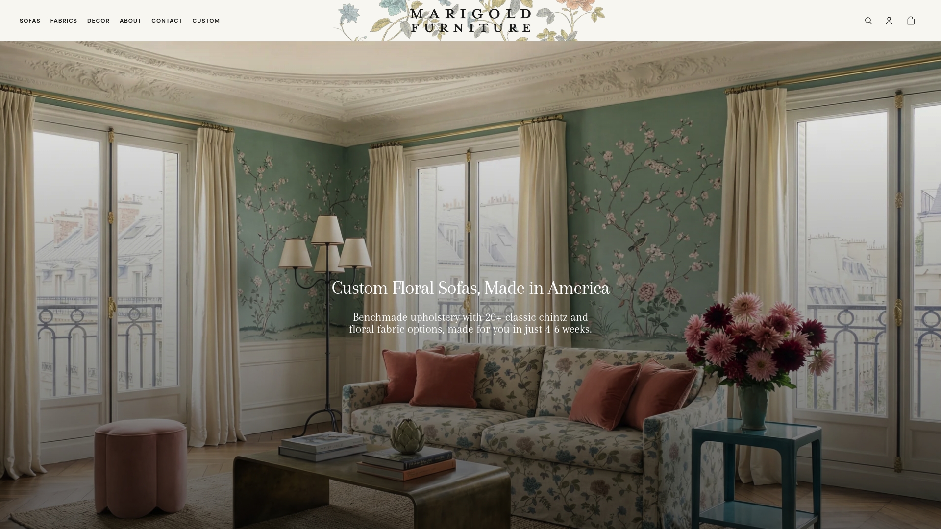
Marigold’s chintz fabrics offer a crisp, light-reflective surface that suits traditional and garden-inspired interiors, while the tufted construction of pieces like the Seville adds tactile dimension without overwhelming the silhouette. Every piece is made to order with a 4–6 week delivery window. If you are ready to put these texture principles into practice, explore custom floral sofa designs and find the fabric that fits both your aesthetic and your life.
FAQ
What is the role of texture in upholstery design?
Texture defines the tactile and visual surface quality of upholstery fabric, shaping comfort, perceived furniture scale, light behavior, and room atmosphere. It is considered equal to color and proportion in textile design principles.
How does texture affect the perceived size of furniture?
Coarse, high-pile fabrics make sofas appear larger and heavier, while smooth, tight weaves make the same silhouette read as lighter and more refined. Choosing texture with scale in mind is a practical spatial tool.
What is fabric hand and why does it matter?
Fabric hand is the tactile character of a textile, meaning how it feels under sustained contact. It is a leading source of post-installation dissatisfaction, often outweighing technical durability metrics in long-term owner satisfaction.
How do I choose between soft and hard fabric textures for a sofa?
Match texture to both your style intent and your lifestyle. Soft, matte textures suit cozy and casual interiors; smooth, firm surfaces suit formal or minimalist spaces. Always test for grip, breathability, and durability before deciding.
What is the 80/20 rule for upholstery texture?
The 80/20 rule states that 80% of a room’s upholstery should use smooth or subtly textured fabrics, with 20% reserved for bold tactile accents. This ratio maintains visual cohesion while preventing a flat, one-note interior.
Recommended
- Upholstery Grade Fabric: What It Is and How to Choose – Marigold Furniture
- Pattern Matching Upholstery: A Designer’s Complete Guide – Marigold Furniture
- Chintz vs Velvet Upholstery: Which Fabric Belongs on Your Sofa? – Marigold Furniture
- Sustainable Upholstery Materials Types: 2026 Guide – Marigold Furniture